Accessible Excel spreadsheets
Excel structure, layout and format
Your spreadsheet must have:
- A logical and clear structure and layout
- Correct formatting
This helps people understand and navigate your spreadsheet.
Spreadsheet structure
To structure your spreadsheet correctly:
- Worksheets must have a clear and descriptive name, to help users understand what information they contain. If your spreadsheet has more than one sheet, make sure the sheets are in a logical order and all their names are unique. Microsoft Support explain how to rename a worksheet.
- Delete any empty sheets - Microsoft Support explain how to insert or delete a worksheet
- If your spreadsheet only has one sheet, we recommend you use cell A1 to include any information users need to know that isn't included in the document title or worksheet name. For example, a summary of the information the spreadsheet shows. Download an example Excel document with a single sheet (Excel doc, 22 KB).
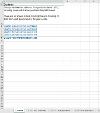
- If your spreadsheet has multiple sheets, we recommend you add a 'Contents' sheet. A 'Contents' sheet should:
- Be the first sheet in the spreadsheet
- Have a descriptive and unique sheet name eg 'Contents'
- Have the word 'Contents' in cell A1
- Have a summary of the information the spreadsheet contains, including the number of sheets, in cell A2
- Have a list of sheet names and links in column A, starting in cell A3. Read our links guidance for how to create internal links in a spreadsheet.
Example of a 'Contents' sheet:

The Office for National Statistics' (ONS) have more advice on structuring spreadsheets and worksheets.
Worksheet layout
To make sure your worksheet layout is correct:
- Position all your content against the left-hand side of the sheet (column A). This means that any text, tables or images in your sheet should start in column A. This reduces the need for users to scroll horizontally and makes content easier to find.
- If a user needs any information to understand a table or image, put this in column A in the row directly above the table or image (there should be no empty rows in between). This includes text titles and summaries.
- Aim to only show one table or image per sheet. However, if the content is closely related - for example, a table and an image showing the same information - you can show this on the same sheet.
- Separate any tables or images by leaving one empty row (only) between them
The ONS have more advice on how to layout worksheets with multiple tables.
Formatting
To format your spreadsheet correctly:
- Use a clear and simple font. We recommend making all text at least size 12.
- Make sure all the content in your spreadsheet is visible. To do this:
- You might need to change the column size (Microsoft Support website) or wrap the text (Microsoft Support website)
- Avoid hiding content, including sheets, rows or columns
- Don't use text formatting like capitalisation, strikethrough, bold, italics or symbols as the only way to convey meaning. If you use them, make sure you explain the meaning in text too.
- Avoid freezing rows and columns, as this can make it hard for users to navigate your spreadsheet using a keyboard. Bear in mind that table headers provide a similar function that is accessible - read our tables guidance for more information. If you do decide to freeze rows or columns, you must provide information about what is frozen and how to unfreeze them. Add this to column A of your spreadsheet.
- If you include a header and a footer, ensure the information in them is also available in the main content of the spreadsheet. This is because screen readers often don't read out header and footer content.
- Avoid including embedded files or media, shapes and text boxes. This is because they are often not accessible for users using a keyboard to navigate or a screen reader.
Other formatting resources
- ONS' advice on using symbols and shorthand
- Microsoft Support explain how to unfreeze locked panes


